
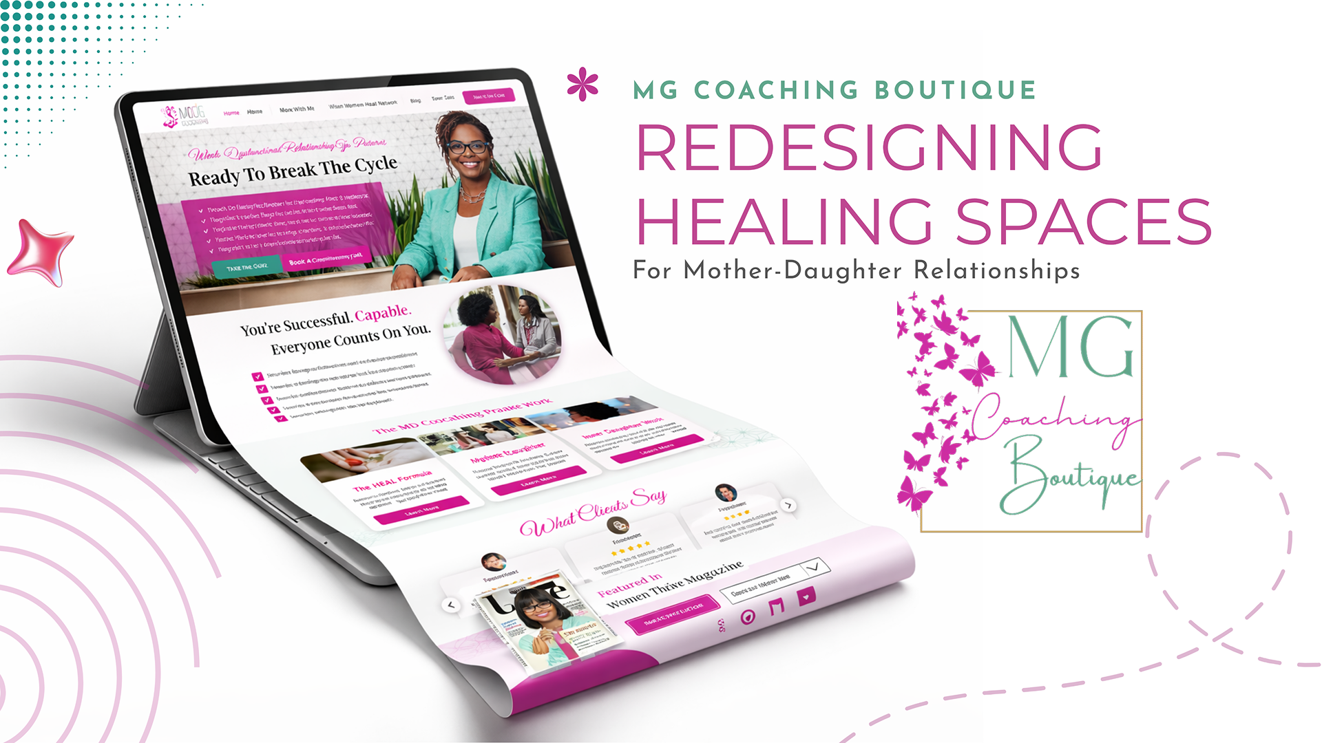


Project Overview
Marsha, the heart behind MG Coaching Boutique, is not just a coach; she is a former therapist who has developed a unique framework to help women over 30 break generational patterns. She came to us with a clear problem: her existing website no longer reflected the depth of her work or the premium quality of her brand. It needed to evolve from a standard informational site to a “Boutique” experience—one that felt exclusive, healing, and actionable. We were tasked with a full redesign to visually communicate her proprietary methods: The HEAL Formula, Mother-Daughter Conflict Detox, and Inner Daughter Work.
Key Objectives
Brand Elevation: Transition the visual identity to match a high-end coaching “boutique” while strictly adhering to the client’s preferred color palette.
Methodology Communication: Clearly explain three complex therapeutic methodologies in a scannable, non-intimidating web format.
Conversion Optimization: Encourage users to take the next step, whether through low-friction “Quizzes” or high-commitment “Discovery Calls.”
Community Building: Highlight physical touchpoints like Workshops, Retreats, and Speaking events to bridge the gap between digital presence and real-world connection.
Understanding the Audience
The target audience is women 30+ seeking healing in their most foundational relationship. This user is likely searching for answers late at night, feeling isolated in their struggle. Therefore, the design needed to prioritize comfort, authority, and privacy. Every visual element was chosen to make her feel “seen” rather than “diagnosed.”

The Visual Design System: A Palette of Healing
Working with the client’s existing colors, we assigned specific psychological roles to each hue:
Empathy Pink (CF2CA2): Used for primary buttons and highlights, this color evokes compassion and self-love.
Serene Mint (60A68C): Applied to backgrounds and secondary elements, this green brings a sense of balance and growth.
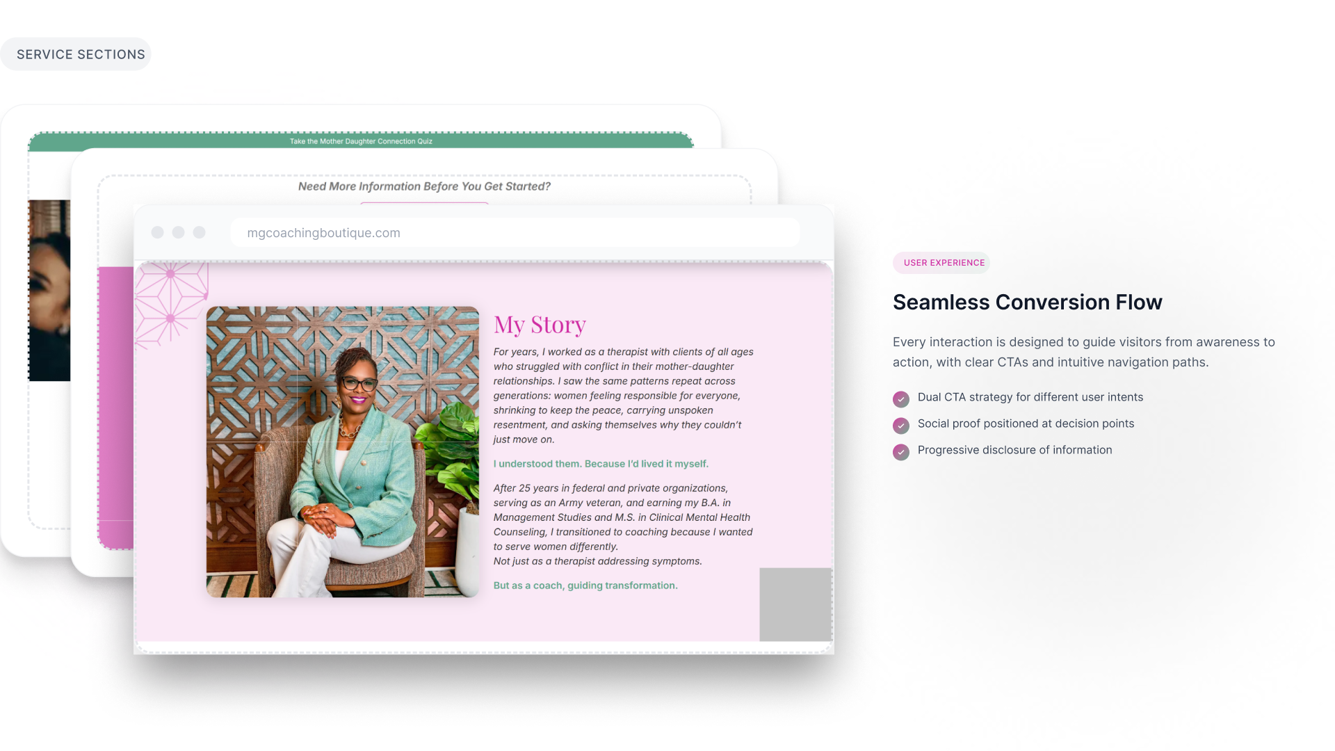
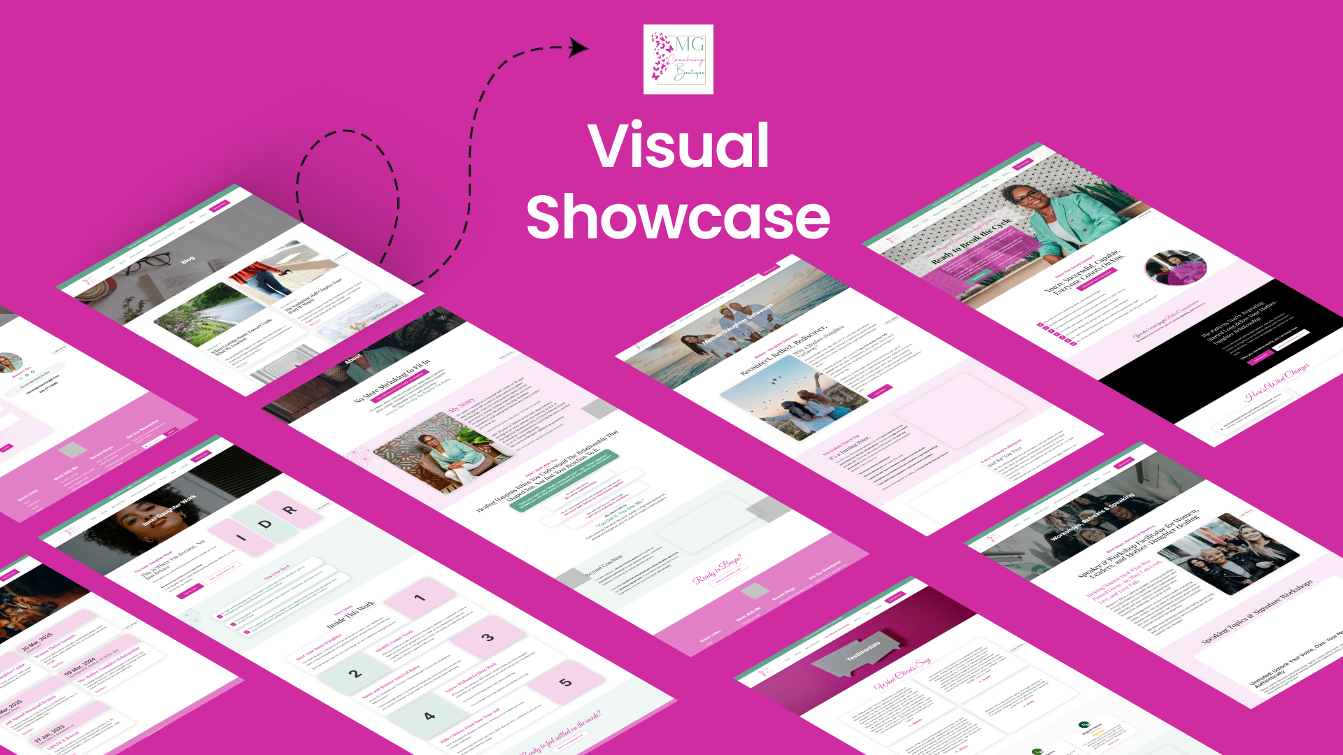
Key Features & User Experience
– The Methodology Matrix: Instead of long paragraphs, we designed card-based layouts for the HEAL Formula and Conflict Detox. Each step (Honor, Examine, Acknowledge, Live) is visually broken down, making the process feel manageable.
– Dual-Pathway CTAs: Understanding that different clients are at different stages of readiness, every methodology section offers a “Take a Quiz” (for self-exploration) and a “Book a Complimentary Call” (for immediate support).
– Community & Events Hub: We designed a dynamic section to highlight upcoming Workshops and Retreats, allowing Marsha to easily update “Save My Spot” buttons as new events are added.

Responsive & Accessible Design
Healing doesn’t happen only during business hours. We ensured the site is fully responsive, providing a seamless experience on smartphones and tablets. We maintained strict WCAG contrast ratios between the colored text and backgrounds to ensure accessibility for all users.

Technical Implementation: Figma to WordPress
After finalizing the pixel-perfect design in Figma, we built the site using WordPress and Elementor. This stack was chosen specifically for the client’s benefit. While we handled the complex styling and custom CSS for the `Heritage Gold` borders and custom button states, the Elementor backend allows Marsha to log in and update her testimonials, event dates, and quiz links without touching a line of code.

Performance & Business Impact
The client, Marsha, was thrilled with the final result. The redesign successfully captured the essence of her “Boutique” brand vision. Since launch, the site has become a true extension of her practice—visually communicating safety and professionalism before the first call is even booked. The clear distinction between her three methodologies has reduced confusion among new visitors and positioned her uniquely in the coaching space.